Delta Air Lines, one of the world’s leading airlines, stands out not only for its global operations and onboard service, but also for its digital presence. In this post, we take a deep dive into its landing pages from the perspective of design, usability, conversion, visual content and digital trends. The goal is to understand how Delta uses its online ecosystem to attract, persuade and retain travelers in a highly competitive environment.
Design and Usability: A User-Centered Experience
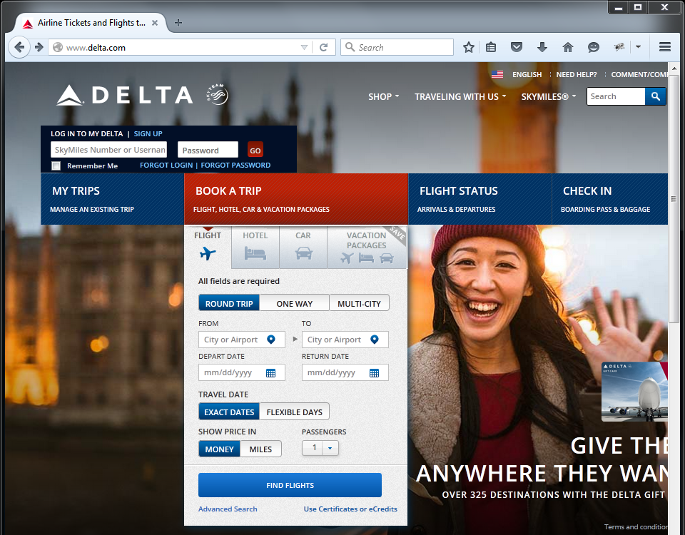
Delta’s landing pages feature a clean, modern, and functional design. White and blue tones dominate, reflecting the brand identity, supported by clear and well-structured typography. Navigation is simple: the top menu remains visible and gives direct access to key functions like “Book,” “Check-in,” “My Account” or “Flight Status.”
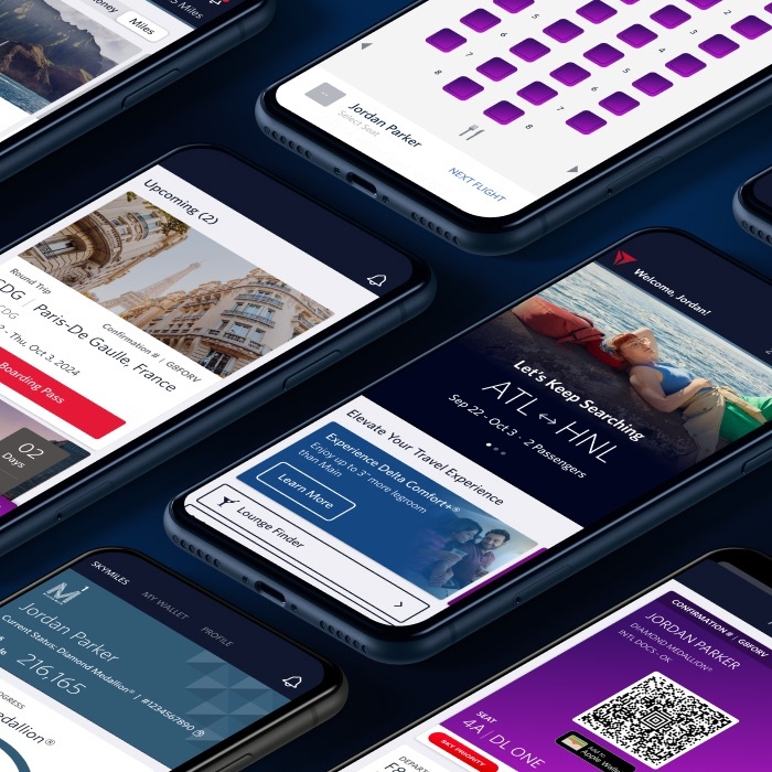
A key strength is mobile responsiveness. On smartphones, pages remain fluid and intuitive, without compromising functionality or design — a sign of a well-implemented mobile-first strategy. Unlike many airlines that compress content on small screens, Delta reorganizes essential elements to facilitate touch interaction.
Compared to other carriers like American Airlines or Lufthansa, Delta favors a minimalist aesthetic where every element has a clear purpose, improving usability and reducing cognitive load.
Conversion Strategies: Effective CTAs and Streamlined Funnels
Delta understands how to guide users toward conversion. Most landing pages feature a prominent CTA at the top — such as “Search Flights” or “Explore Our Deals” — styled in contrasting red or dark blue to ensure visibility and clickability.
The booking process is streamlined to reduce friction: only three steps are needed to start a search and reach an offer. Content unfolds progressively, avoiding information overload in early steps.
Campaign pages — such as seasonal deals or SkyMiles perks — include simple, dynamic forms and use urgency (“last days,” “limited seats”) as a persuasive tactic.
Storytelling and Visual Content: Emotions in Every Flight
Delta has evolved its visual storytelling toward a more emotional and experiential approach. Especially on route and destination pages, high-quality imagery, inspiring destination videos and real traveler testimonials dominate.
The storytelling is not only aspirational but also functional. For example, the “Flying Delta One” landing page walks the user through the premium experience — from lounge to lie-flat seat — almost like a cinematic journey. This type of narrative helps justify the added value of premium service and differentiate from competitors like United Polaris or Air France La Première.
This emotional branding also shows up in campaigns like “Keep Climbing,” consistently featured across key pages, reinforcing brand identity and emotional connection.
Social Media and Digital Marketing Integration
Delta effectively integrates social media with its landing page strategy. On many pages, especially promotional ones, users can share content or follow the brand directly. Sometimes Instagram posts from real travelers or YouTube videos are embedded directly into the landing.
They also leverage remarketing effectively. If a user abandons a booking, they’ll often see personalized ads with CTAs pointing directly back to the relevant landing page. Influencer campaigns also help drive qualified traffic to targeted pages.
A notable best practice is the use of UGC (user-generated content) in destination pages, which boosts authenticity and encourages community participation.
Personalization and Segmentation: Tailored Experiences
Delta applies multiple layers of personalization. One is geolocation, showing local currency fares and nearby airport offers. Browser language is also detected and content adjusts accordingly.
For SkyMiles members, behavior-based personalization kicks in: landings show frequent destinations, tier-specific offers and tailored suggestions based on travel preferences (business, weekend escapes, etc.).
These strategies not only improve the experience, they also significantly boost conversion rates by delivering hyper-relevant content.
Web Design Trends: Simplicity, Interaction and Accessibility
Delta’s landing pages incorporate several current UX and web design trends:
- Functional minimalism, with generous white space and clear visual hierarchy
- Microinteractions (hover animations, button feedback) that enhance interactivity without clutter
- Accessible typography and large buttons for mobile and visually impaired users
- Vertical scroll layouts that allow fluid navigation without page reloads
Compared to more traditional airline websites, Delta’s design feels fresh, intuitive and aligned with global digital expectations.
SEO, SEM and Visibility Analysis
From an SEO perspective, Delta has a strong presence with optimized structures and keywords such as “cheap flights to…” and “book flight to…”. Landing pages use proper headers (H1, H2) and meta descriptions.
Sistrix data shows stable visibility, with peaks during summer and holiday campaigns. Destination pages like New York or Los Angeles perform well due to strong internal linking and solid technical SEO (speed, original content, alt tags).
Their SEM efforts are also well-developed, with Google Ads and Bing campaigns linking directly to segmented landing pages — increasing conversion by reducing friction.
Technology and Innovation: Beyond the Click
Delta uses several advanced tools to enhance user interaction:
- 24/7 chatbot support, embedded directly in landing pages
- Virtual assistant to suggest options while building itineraries
- Live weather API to display real-time destination forecasts
- Interactive virtual tours for premium cabins and lounges, reducing uncertainty
These technologies go beyond aesthetics — they reduce doubt, improve user support and enhance conversion.
Where Delta Could Improve – and How Smartvel Can Help
Although Delta Air Lines’ digital marketing strategy is solid, there’s room to level up through content innovation and personalization. Here’s where Smartvel can make a difference:
- Inspiration for destination landings: Currently very functional, Delta could enrich them with live content on what to do, see or attend — all powered by Smartvel’s dynamic destination platform.
- Post-booking engagement: There’s little inspirational follow-up after purchase. Smartvel offers tailored guides by date and destination to keep travelers engaged until take-off.
- Deeper personalization: Delta personalizes by location and language, but not by interests or travel style. Smartvel allows dynamic content to adapt to each user’s profile in real time.
- Limited long-tail SEO capture: Our content solutions help Delta rank for intent-based searches like “things to do in Seattle in summer” — reaching users earlier in the journey.
- Disconnected social content: Campaigns and influencer content rarely make it onto landings. Smartvel can embed curated social content contextually and dynamically.
With Smartvel, every landing page becomes a fully personalized and engaging micro-experience — helping Delta connect more deeply and convert more effectively.
Conclusion
Delta has a solid foundation: clean design, smooth navigation and optimized conversion funnels. However, there is great room for improvement in how they connect with the traveler from the content, especially in the inspiration and preparation phases of the journey.
This is where Smartvel can make a difference: with dynamic, personalized and contextual content that not only increases engagement and conversion, but also positions Delta as an end-to-end travel partner, not just a transportation provider.